#css filter
Explore tagged Tumblr posts
Visit Tumblr Blog
Explore Tumblr blogs with no restrictions, modern design and the best experience.
Last Seen Tumblr Blogs


Fun Fact
The average Tumblr user visits about 67 pages every month.
Text

CSS Portrait Image Effect
#css portrait image effect#css effects#pure css effects#html css#codenewbies#frontenddevelopment#css#html5 css3#latest css effects#css tricks#html css tutorial#css filter
1 note
·
View note
Text

Blur Background Image using CSS
#blur background image css#css blur#css filter#css tricks#css effects#learn to code#code#html css#codingflicks#css#html#css3#webdesign#frontend#frontenddevelopment
1 note
·
View note
Text
Shoutout to Neopets for looking a bunch of kids dead in the face and going "oh you want to format that paragraph of yours? learn CSS and HTML"
#neopets#neotag#outdesign posts things#it's honestly pretty fun coding pages not gonna lie#though it is a pain that the filters haven't been updated in 20 years. what do you MEAN 'position' isn't a valid CSS element
113 notes
·
View notes
Text
Responsive Sortable Table for HTML Websites
People watch website both from Laptop and Mobile. So, when a web developer creates Table, he or she should make it as responsive. Sometimes it is important to set different color for odd and even row that reader can read the table easily. This Code can make your Table Header sortable too.
#HTML#HTML website#CSS#CSS3#Different Color for Odd and Even Row#Even Row#Filter Table#Filterable Table#Hover on Table Row#Odd Row#Responsive#Responsive CSS Table#Responsive Table#Sortable Table#Table
2 notes
·
View notes
Note
eyes
👀
2 notes
·
View notes
Note
hi could you give any advice on making the language filter from ao3/works/54924919 ...work? i'm in a majority non-eng fandom and desperate for a way to filter out non-eng lang fics for good. thanks
I would heavily recommend using AO3's built-in language filtering feature here.

This is because CSS filters can only hide elements. 20 works are loaded per page, so if only 5/20 of the works are in English, a CSS filter would leave you with a page that is only 5 works long. the built-in language filter will always give you pages of 20 works until it there aren't any works left to list in a group of 20. CSS filters are best used sparingly and for filtering out things that aren't seen in a large percentage of works. but if you do not mind shorter pages, here is what you can use:
.work.blurb:not(:has(dd.language:lang(en))){ display:none; }
#ao3 should add a better language filter#this is all we have for now sadly#ao3#archive of our own#ao3 css#ask
1 note
·
View note
Text
Ublock Origin
Youtube: SponsorBlock (skips ads within videos), DeArrow (replaces clickbait thumbnails & titles), Blocktube (block channels), Enhancer (Quality of Life features), Youtube-Shorts Block
Youtube Mobile: Youtube Vanced/Revanced Manager
Twitter: Minimal Theme extension
Tumblr: xKit/xKit Rewritten, Dashboard Unfucker, Stylus with "Old Tumblr Dashboard" userstyle
Spotify: xManager (desktop & mobile)
Firefox: High chance you'll love it and curse holding out for so long.
Linux: No whiney search box trying to Edge you, no ads in the start menu, no trending searches reminding you about celebrity gossip & politics.
i would move heaven and earth to avoid hearing one single advertisement
#I'm not going to blindly tell you to “switch to Linux” but you can easily test it out in a Virtual Machine within windows.#There are guides online that will hold your hand through the setup process. Linux Mint is not scary. You might love it.#If setting up a VM still feels like too much? Then yeah stick with Windows. That's understandable.#but if you're reading this far then you must have caught on to how your ability to fight back is tied to your tech literacy skills#If you're already following workaround guides to forcibly disable Windows features that piss you off or install modified apks...#then you're halfway there#we all pick our battles & hills to die on though (My deepest condolences if you require Adobe for work 🥲)#There is also Ublocks 'element picker' but you can cause more confusion than good if#you don't know what you're doing (You can always remove filters)#Or do what uBlock picker does by learning a tiny bit of CSS and you can make anything you want on a website go bye-bye#pssst! ''display: none'' & ''visibility: hidden'' CSS declarations#I originally listed all this in the tags and realized it was a mess. May as well keep the tags now though:#Linux#Firefox#uBlock Origin#SponsorBlock#Youtube-Shorts Block#DeArrow#Youtube Vanced#ReVanced Manager#Revanced#Minimal Theme for Twitter#Stylus#xkit#xkit rewritten#Dashboard Unfucker#xManager#I spent my morning free-time on this 😪
58K notes
·
View notes
Text
8 CSS & JavaScript Snippets for Creating Sticky Elements — Speckyboy
New Post has been published on https://thedigitalinsider.com/8-css-javascript-snippets-for-creating-sticky-elements-speckyboy/
8 CSS & JavaScript Snippets for Creating Sticky Elements — Speckyboy
Modern websites often feature extensive scrolling. Long pages are common on desktop devices, but are even more frequent on mobile screens. The practice creates usability challenges for tasks like navigation and referencing important information.
That’s where “sticky” design elements come in handy. They allow users to scroll without losing access to your site’s menu. You can also use them to keep ads in view, attach social media sharing buttons to the viewport, or create fun special effects.
Implementing a sticky element can be simple, as CSS has a dedicated position property for this function. JavaScript can be used for building more robust features. As usual, there are several methods to achieve your goals.
We searched the CodePen archives to find interesting examples of sticky elements in use. Below, you’ll find various options that enhance the user experience. So, get stuck in your easy chair and be inspired by these code snippets!
Pure CSS Header Animation to Sticky Navigation
Created by Amit
Sticky headers are among the most popular use cases. On Chromium browsers, this snippet uses CSS to transform a tall and narrow header into a full-screen bar upon scrolling. Unsupported browsers receive a narrower, taller, sticky header. Keyframe animation is used to create smooth transitions. The feature is useful, lightweight, and attractive.
See the Pen Pure CSS header animation to sticky nav by Amit
Sticky Responsive Sidebar Navigation
Created by Areal Alien
Sidebar navigation can also take advantage of staying put during scrolling. Hovering over the sidebar expands the navigation to include text labels – it works on mobile too. However, you might also reserve this concept for large screens and use the traditional “hamburger” menu for mobile.
See the Pen Sticky responsive sidenav by Areal Alien
CSS Sticky Table Header & Column
Created by Mike Golus
Long HTML tables can be a pain to read. You have to memorize the column headers to understand the context. Sticky headers make even the busiest tables easier to read. Using position:sticky (and a few other tricks) on the first row and column enables scrolling without losing sight of key information. The examples in this Pen demonstrate how it’s done.
See the Pen CSS Sticky Table Header and Column by Mike Golus
Long Scroll Sticky Sections
Created by Burmese Potato
Here’s a unique way to denote the various sections of a long page. Scroll down the page, and the episode number (displayed in the left column) sticks until you reach the end of the section. The snippet combines sticky positioning with the calc() property on the container’s height to keep the number in view. This little bit of CSS adds a nice touch to the user experience.
See the Pen Pretty Sticky by Burmese Potato
Just Another Sticky Section Layout
Created by Misala
Sticky design elements can also be used to show off product features. Scroll down this page and watch as featured text and videos change. The layout occupies the entire screen viewport and is responsive for mobile devices. It’s a high-end feature sure to capture a user’s attention.
See the Pen just another sticky section layout by misala
Multi-Navigation Sticky Bars & Layout
Created by Den
This snippet asks the question: What if you have more than one navigation bar? The first bar is sticky by default. Scroll past a few sections, and a second sub-navigation bar lines up underneath. That second bar also features a neat frosted glass look as content scrolls underneath.
See the Pen Sticky layout + filters #2024 by Den
Sticky Video with CSS @container scroll-state()
Created by Jhey
We’re seeing more websites implement sticky videos, where the presentation sticks to the bottom corner upon scrolling. It allows users to view the rest of your content without losing sight of the video. Here, CSS container queries are used to reposition the video player. Use the included config panel to see how different settings impact the animation effects.
See the Pen CSS @container scroll-state() faux PiP video by Jhey
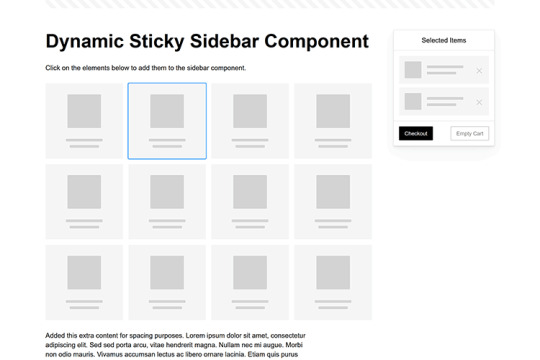
Dynamic Sticky Sidebar Component
Created by Ryan Mulligan
Features like shopping carts are a perfect fit for sticky sidebars. The UI makes it easier for shoppers to keep track of their cart and, most importantly, finish their purchase. This sidebar widget keeps track of cart contents and sticks to the screen while you scroll in the page content area.
See the Pen Dynamic Sticky Sidebar Component by Ryan Mulligan
Stick With What Works in Your Designs
We may think of sticky elements as being used for site headers and navigation. However, the examples above show that they can do much more. There are so many creative possibilities for informing and entertaining users.
What’s more, CSS can do a lot of the heavy lifting for you. Several snippets in this collection don’t require a single line of JavaScript. Still, it’s nice to know you can add some DOM manipulation when needed.
We hope this collection sparked your imagination! Check out our CodePen collection for even more sticky snippets.
Related Topics
Written by Eric Karkovack
Eric Karkovack is a web designer and WordPress expert with over two decades of experience. You can visit his business site here. He recently started a writing service for WordPress products: WP Product Writeup. He also has an opinion on just about every subject. You can follow his rants on Bluesky @karks.com.
Read more articles by Eric Karkovack
#2024#ADD#alien#amp#animation#Articles#attention#Building#Business#buttons#Capture#change#chromium#code#container#content#CSS#CSS Layout Snippets#CSS Snippets#Design#desktop#devices#easy#effects#Featured#Features#Filters#Full#glass#hamburger
0 notes
Text
Fun little hack, this works best on a site with motion like youtube 1. Create a new browser bookmark, name it whatever 2. Paste the code into the URL field. 3. Go to any site, click your new bookmarklet 4. Profit! (refresh the page to undo the effect)
javascript: (() => {document.querySelector("html").animate([{filter: 'brightness(1.7) grayscale(1) blur(0.15vw) contrast(100000%) contrast(.7) sepia(100%) hue-rotate(0deg)'},{ filter: 'brightness(1.7) grayscale(1) blur(0.15vw) contrast(100000%) contrast(.7) sepia(100%) hue-rotate(360deg)' },],{duration: 20000, iterations: Infinity});})();

0 notes
Text
In the wake of the TikTok ban and revival as a mouthpiece for fascist propaganda, as well as the downfall of Twitter and Facebook/Facebook-owned platforms to the same evils, I think now is a better time than ever to say LEARN HTML!!! FREE YOURSELVES FROM THE SHACKLES OF MAJOR SOCIAL MEDIA PLATFORMS AND EMBRACE THE INDIE WEB!!!
You can host a website on Neocities for free as long as it's under 1GB (which is a LOT more than it sounds like let me tell you) but if that's not enough you can get 50GB of space (and a variety of other perks) for only $5 a month.
And if you can't/don't want to pay for the extra space, sites like File Garden and Catbox let you host files for free that you can easily link into NeoCities pages (I do this to host videos on mine!) (It also lets you share files NeoCities wouldn't let you upload for free anyways, this is how I upload the .zip files for my 3DS themes on my site.)
Don't know how to write HTML/CSS? No problem. W3schools is an invaluable resource with free lessons on HTML, CSS, JavaScript, PHP, and a whole slew of other programming languages, both for web development and otherwise.
Want a more traditional social media experience? SpaceHey is a platform that mimics the experience of 2000s MySpace
Struggling to find independent web pages that cater to your interests via major search engines? I've got you covered. Marginalia and Wiby are search engines that specifically prioritize non-commercial content. Marginalia also has filters that let you search for more specific categories of website, like wikis, blogs, academia, forums, and vintage sites.
Maybe you wanna log off the modern internet landscape altogether and step back into the pre-social media web altogether, well, Protoweb lets you do just that. It's a proxy service for older browsers (or really just any browser that supports HTTP, but that's mostly old browsers now anyways) that lets you visit restored snapshots of vintage websites.
Protoweb has a lot of Geocities content archived, but if you're interested in that you can find even more old Geocities sites over on the Geocities Gallery
And really this is just general tip-of-the-iceberg stuff. If you dig a little deeper you can find loads more interesting stuff out there. The internet doesn't have to be a miserable place full of nothing but doomposting and targeted ads. The first step to making it less miserable is for YOU, yes YOU, to quit spending all your time on it looking at the handful of miserable websites big tech wants you to spend all your time on.
#this is a side point so it's going here but I really think tech literacy should be a requirement in schools like math grammar history etc.#we live in a world so dominated by the stuff and yet a majority of the population does not understand it at even the most fundamental level#tiktok#tiktok ban#indie web#neocities#web development#current events#twitter#facebook#meta#amazon
11K notes
·
View notes
Text
Aplicar efectos a las imágenes con CSS
Sabias que es posible aplicar efectos a las imágenes con CSS. Así como lo lees, utilizando una propiedad de CSS llamada filter, puedes seleccionar entre una larga lista de opciones para modificar las fotos directamente desde el navegador. Introducción a los Filtros La apariencia visual de nuestros elementos web puede marcar la diferencia en la experiencia de usuario. Afortunadamente, CSS nos…

View On WordPress
0 notes
Text
#css#css3#different color for odd and even row#even row#filter table#filterable table#hover on table row#odd row#responsive#responsive css table#responsive table#sortable table#table#prestashop#prestashop table
0 notes
Text


XOXO - RPG THEME SET - 1k SPECIAL !!!
This theme set is completely free. It is a special thank you for 1k followers. Please support me and my work by liking and reblogging this post!
[ BLOG THEME INFORMATION ]
Option between 400px, 450px, 500px and 540px posts.
Custom Body Fonts and Body Font sizes (11px - 13px)
Two Custom Header Links
Two Dropdown Links with unlimited link options
Dropdown Links are optional
Fully supports NPF (beta editor) posts.
The theme adjusts to different screen sizes.
Visible Source Link & Scroll to top button.
A lot of the design can be changed in the editing panel. Everything else is explained in the code.
Sidebar Boxes for: Welcome, Events, Admins, Quick Links and Schedule
Quick RPG Information on the header (Member & Application count, short rp information and Plot description)
Disclaimer and further blog information in the footer.
Sticky Sidebar
Footer can be turned off.
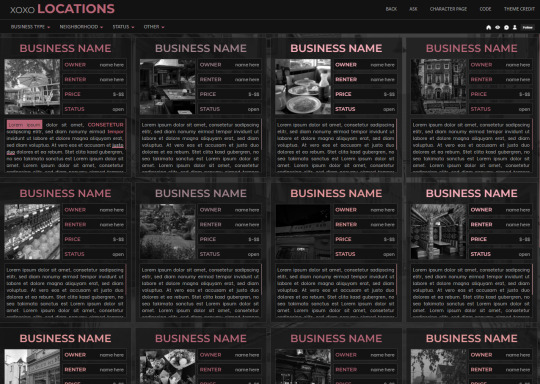
[ LOCATION PAGE ]
The Page does not contain any javascript (100% java free)
Comes in 2 versions (with and without filters)
Location picture sizes are 130 x 130. They will resize automatically.
Option for a background picture.
3 Custom Links
All colors can be easily edited on top of the css code
The theme will resize to different screen sizes.
Custom accent colors (explanation in the code)
[ CHARACTER PAGE ]
The Page does not contain any javascript (100% java free)
Comes in 2 versions (with and without filters)
Character picture sizes are 155 x 150. They will resize automatically.
Option for a background picture.
3 Custom Links
All colors can be easily edited on top of the css code
The theme will resize to different screen sizes.
Character boxes have custom links.
Custom accent colors (explanation in the code)
[ GUIDELINES ]
Do not claim as your own.
Do not remove the credit!
Do not use as a base code or take parts of this code for your theme.
Feel free to edit as much as you want!
All credits are mentioned in the code!
Static Blog Theme Preview + Page Preview Links + All Codes Location Page Preview + All Codes Character Page Preview + All Codes All codes (without preview)
#rpg theme#rp theme#free theme#non contained theme#character page#location page#page theme#rph#rpc#rp resources
844 notes
·
View notes
Text
We really need to take a moment to give Neopets' petpages a shout-out
Hundreds of pages full of oftentimes niche useful information or helpful resources
Oftentimes fun layouts and designs with personality, harkening back to the pre-mobile internet days
Unironically taught an entire generation of kids HTML and CSS
Hosted right on the site so it's extremely easy to get started
Other users are nice enough to make layouts and graphics for everyone to use
Last bastion of the internet pre-enshittification (along with Neocities)
While we're at it, here's a few of my fav pages:
Quality Petpages, Kalux Directory: Petpage directories!
Dream Colors Directory: Fake pet designs and edits!
Silent Serenity, That Kills Me, Sygyzy, Alula, Hime's CSS, Jinx: Pre-made templates for userlookups and petpages!
Filter Solutions, Trudial's Coding Help: Coding help and troubleshooting!
Neopian Times Community Feedback, Neopian Times FAQ: Neopian Times and writing resources!
Owls, Valisar: NC trading values!
SeasonalAttackP, Battle On!, Battledome NP Rewards: Battledome info!
#neopets#neotag#outdesign posts things#this is petpage propaganda you should make a petpage now if you're on neopets#I've already got like two made and I'm working on a third#it's fun! and helps you brush up on your coding skills
437 notes
·
View notes
Text
how to change the colours of the fic blurb icons with a site skin on ao3

The icons are all images, and images can be modified using CSS filters. I changed these by rotating the hue (moving the colour around a colour wheel) until each icon was a shade of green. I also manipulated the brightness, contrast and sometimes other filters.
The code I used is under the cut. Feel free to copy and modify it for your own site skins! (Note: I grouped together icons that had the same background colour)
I was just eyeballing it and not using any particular tools, but if you have tool recommendations for making the colour choices more precise, feel free to share them in the notes!
Full site skin, including this code, is available on github
span.rating-general-audience.rating, span.category-gen.category, span.complete-yes.iswip { filter: sepia(30%) saturate(60%) brightness(70%) contrast(160%) hue-rotate(40deg); }
span.rating-teen.rating { filter: invert(100%) brightness(130%) hue-rotate(280deg) saturate(40%); }
span.category-slash.category { filter: brightness(150%) saturate(40%) hue-rotate(280deg); }
span.category-het.category { filter: brightness(170%) saturate(40%) contrast(80%) hue-rotate(160deg); }
span.category-multi.category { filter: brightness(120%) saturate(40%) sepia(130%) hue-rotate(80deg); }
span.rating-mature.rating, span.warning-choosenotto.warnings { filter: saturate(40%) hue-rotate(110deg) brightness(80%) contrast(120%); }
span.rating-notrated.rating, span.category-none.category, span.warning-no.warnings { filter: brightness(0) saturate(100%) invert(6%) sepia(52%) saturate(815%) hue-rotate(250deg) brightness(91%) contrast(102%); }
span.rating-explicit.rating, span.category-femslash.category, span.warning-yes.warnings, span.complete-no.iswip { filter: hue-rotate(160deg) contrast(80%) saturate(80%) brightness(120%); }
156 notes
·
View notes